ADORA EXPERIENCES
Bringing campus to life
Team
3 Designers
2 UX researchers
1 Engineer
1 SDE Intern
Toolkit
Figma
Sketch
Adobe Suite (Ps, Ae,Pr)
Context
COVID-19 forced universities to shut down and prospective students needed a way to visit schools. Adora Experiences created an app to allow students across the globe to visit schools, just like they were there in person.
My role
As the lead UX Designer of this app redesign, I redesigned Adora's augmented reality (AR) feature to be more usable, interactive, and valuable for visitors.
The ask
Based on the current AR feature as well as feedback from beta testers when the co-founders first launched this feature, I had the task to create redesigns that filled three problem areas:
🏃🏻
Create a first run experience
There’s no formal onboarding process for visitors who are unfamiliar with AR.
The current interface makes it challenging to recognize areas in the app that are interactive.
Users didn't read school content, preventing them from connecting to a school’s campus.
Creating a user persona
To follow a human centered design approach to my project, I created a user persona named Alexandra.
About
Senior in high school, new to the admissions process
Goals
Open to exploring schools, wants to stay close to home
Pain points
Doesn’t trust tours, wants to connect to student
Design question
In order to help me ideate solutions and focus on right pain points throughout my project, I posed a design question:
How might we teach visitors, like Skye, about Adora's AR feature in an engaging manner to allow them to connect to a school's campus?
Competitive audit
My team conducted a competitive audit with 7 AR apps. We uncovered that other AR apps in the market have an onboarding process, uses a modal to expand additional information, and uses various icons to indicate interactive areas on the screen.

Onboarding screen
Informational modal

Intuitive icons
Identifying constraints through design critique
From these rapid prototypes, I led a design critique with the team to identify any engineering constraints with the designs that we had created.
🕙
A constraint that I recognized was this feature needed to be shipped out to engineering in 1 month so that it could be built in time before the end of the sprint.
Narrowing down design explorations


This constraint meant that an animated onboarding process as well as lines that visually indicate the location of an area would not meet this time expectation.
Returning to the rapid prototyping stage
After acknowledging these engineering and thus design constraints, the designer and I went back to the rapid prototyping stage to ideate more feasible solutions.
Receiving feedback from an external stakeholder
After creating multiple wireframes and prototypes, I asked an external stakeholder to critique my team’s high fidelity prototypes in order to receive an objective review on whether or not the designs we created were useful and fair. Here’s what I pulled from our conversation:

Design A
It’s unclear that the tags on this design is interactive.

Design B
It is apparent and clear that these tags can be clicked
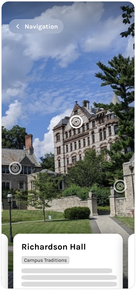
The redesigned experience
Onboard visitors
Provide a learning moment for visitors on how to use AR.
New and interactive hotspots
Interactive hotspots and cards increase usability.
Engaging and useful content
Images inside of a building, attribute tags, and accessibility markers engage visitors.
Success metrics
In terms of how I would measure success within this project, I would do so by:
Measuring the time spent on onboarding screens
A higher amount of time would indicate that inexperienced users are learning how to use the feature.
Measuring the number of clicks on the informational modal
A high number of clicks would indicate that users understand that the modal is interactive.
Measuring the time spent on the informational modal
A high amount of time would indicate that visitors are exploring the content we have to offer.


.gif)